City of Cabot
Brand Strategy • Branding
Cabot, Arkansas is a community whose reputation extends beyond its city limits. As a community of choice for many years, the community is now in a position to evaluate how it is perceived by potential residents and employers.
Cabot is regionally recognized for its economic growth and prosperity, and generally thought of as a “bedroom community.” With an understanding of this label, Cabot is taking steps to rewrite the narrative and guide the community toward a future that is less monolithic and more inclusive, embracing the best parts of the community - the welcoming kindness known and experienced daily by residents. As part of a forward-thinking strategy, Thrive developed a new visual identity through an extensive community engagement process that included many leaders and stakeholders in Cabot. With a new visual identity, Cabot will have a unifying element and the opportunity to present the community’s potential to the region with consistency and vibrancy.
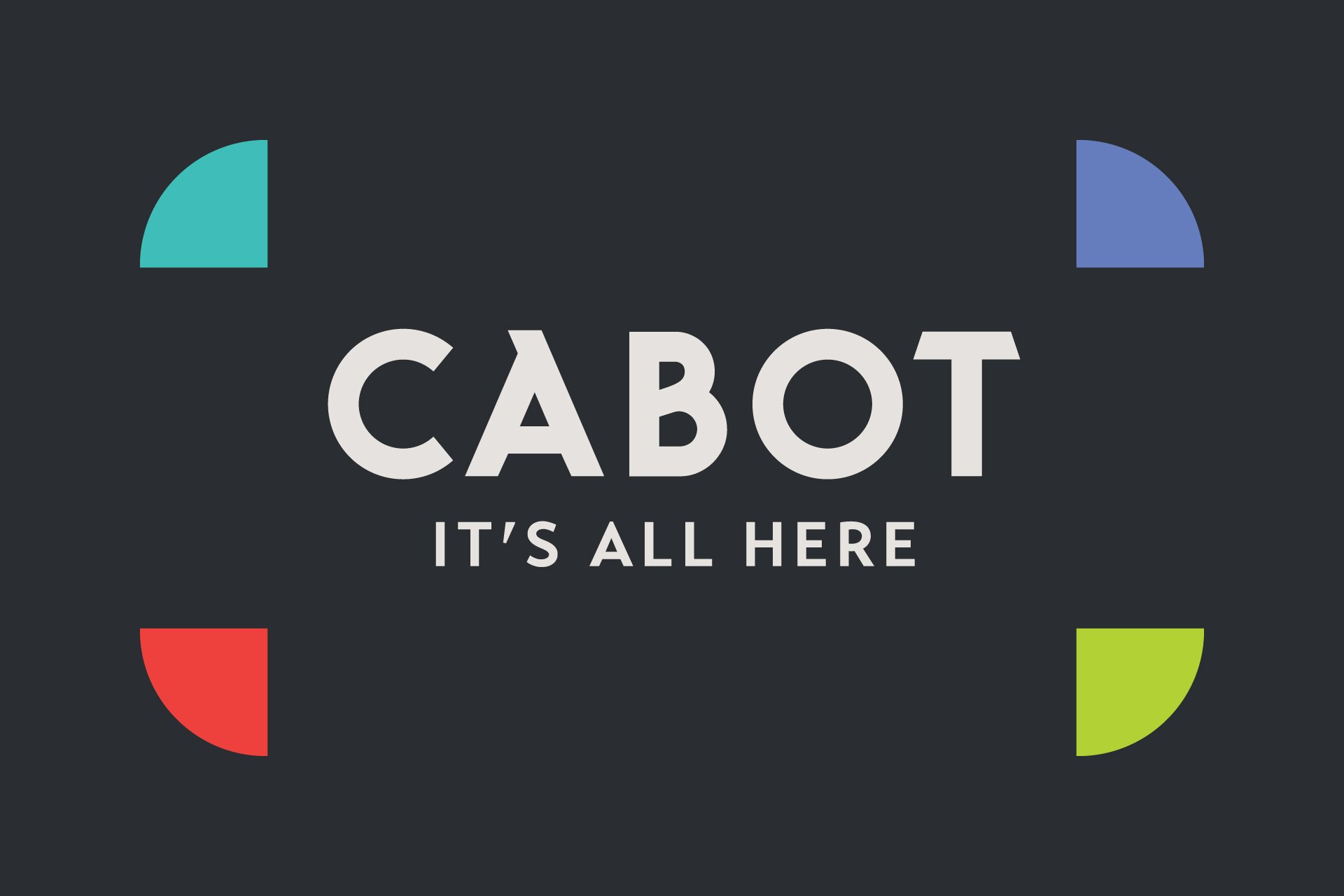
The identity is centered around the Cabot C, a logo mark that represents several unique aspects of the community:
A city street grid, referencing downtown Cabot and its commerce as well as Cabot’s history as an important transportation hub

The building block construction of the mark symbolize Cabot’s growing infrastructure and residents’ initiative to build an even greater Cabot.

The inward arrows reinforce the concept that Cabot is the center of the action, and everything you need is all here. It also references the Arkansas diamond symbol and Cabot’s prominent athletics facilities.

The different colors of the arrows symbolize the many unique communities and individuals of Cabot collaborating build the future together.